Project Overview
Tomoca Coffee, A heritage Ethiopian coffee brand, aimed to digitize its customer experience without compromising its rich cultural identity. This UX project focused on designing seamless desktop experiences for ordering coffee, managing payments, and exploring the brand’s history. The app’s interface draws inspiration from Ethiopian coffee culture through visual language, storytelling, and interaction design, ensuring that Tomoca’s legacy, craftsmanship, and traditions are reflected in every digital touchpoint.
Goals
Create an intuitive ordering flow for coffee and snacks
Integrate cultural storytelling into the digital experience
Ensure secure and frictionless payment
Support location-based pickup and delivery options
Build brand loyalty through personalization and visual design
Research & Discovery
User Interviews
Conducted with local customers and diaspora coffee lovers
Competitive Analysis
Benchmarked against local coffee shops, Chaka Coffee, Mpye Coffee, and Kaldi’s Coffee
Cultural Immersion
Studied Ethiopian coffee ceremonies and traditional serving methods
Key Features & UX Decisions
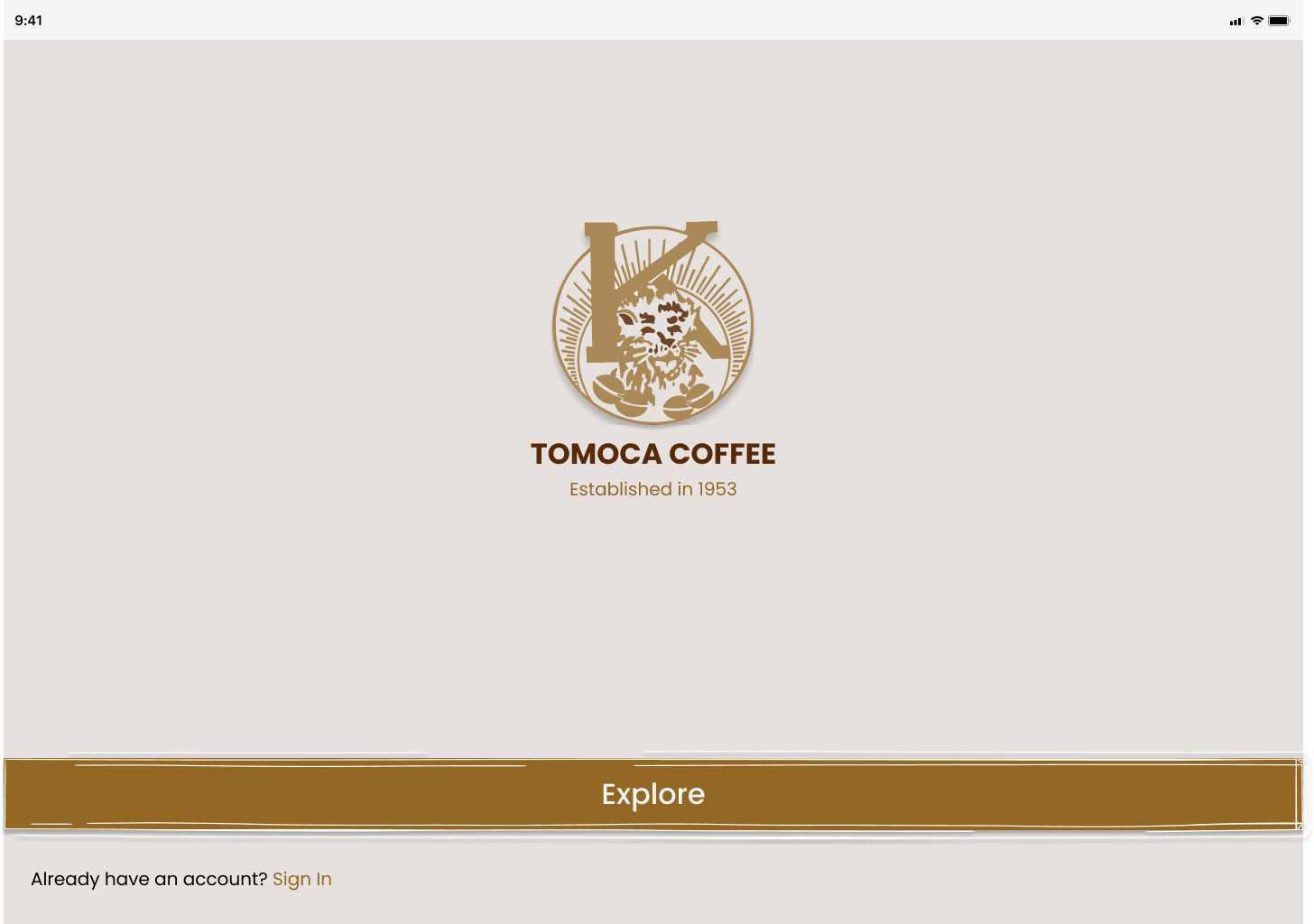
1. Welcome & Onboarding
Minimalist welcome screen with heritage branding
Clear CTA:
"Explore" or "Sign In"
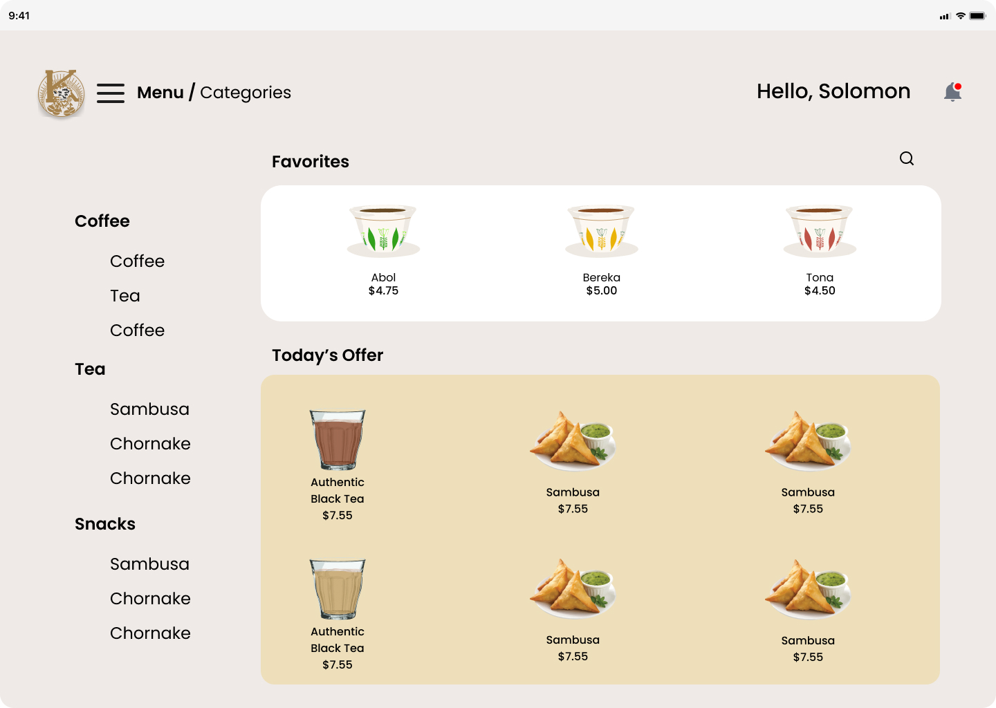
2. Menu Navigation
Categorized layout: Coffee, Tea, Snacks
Personalized
greeting: "Hello, Solomon"
Favorites and daily offers
highlighted visually
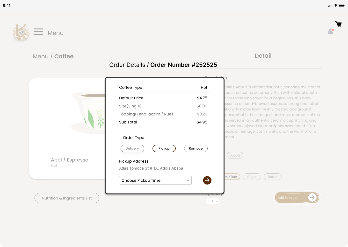
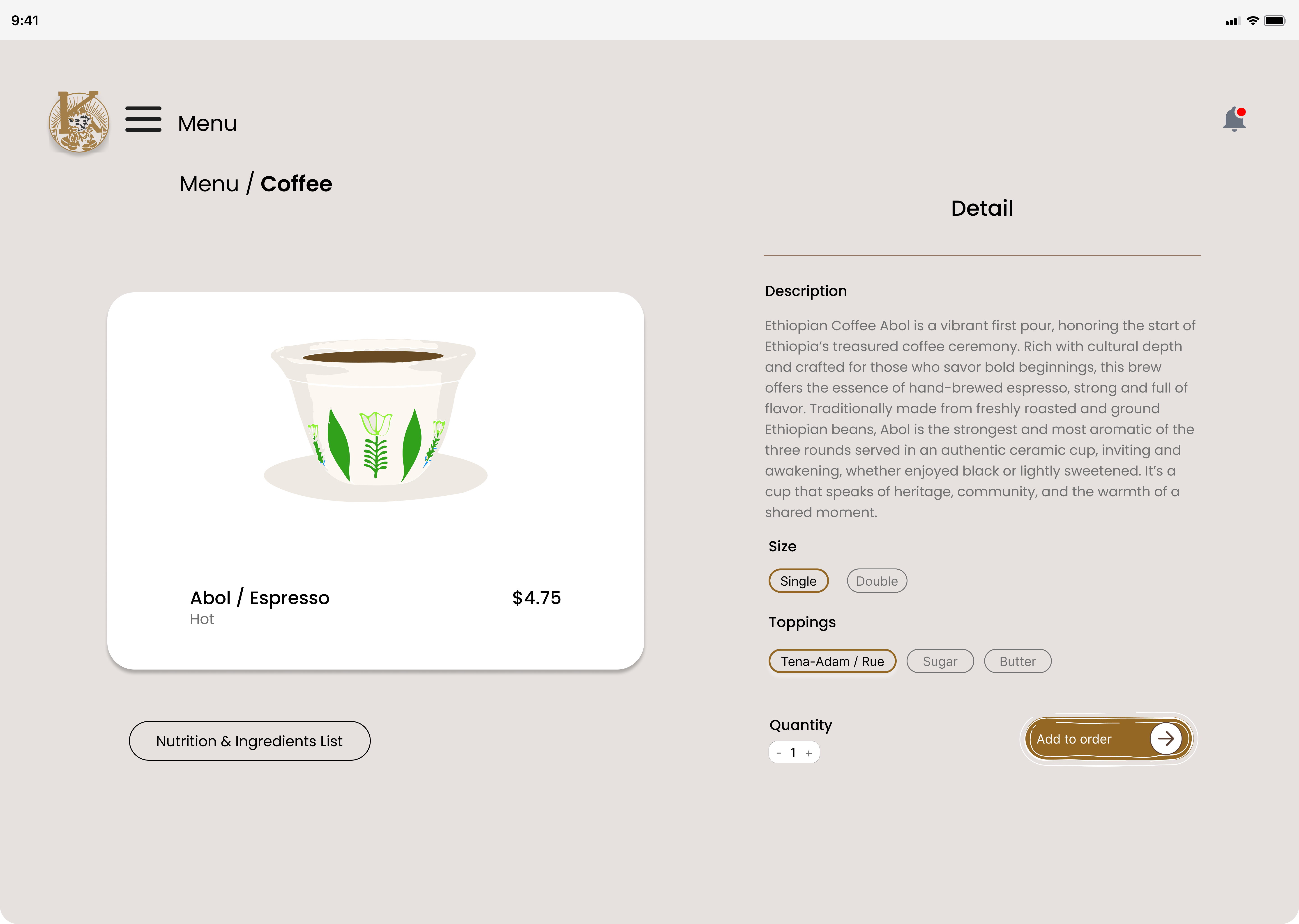
3. Product Customization
Rich storytelling for each coffee (e.g., Abol Espresso)
Customizable
options: size, toppings, quantity
Nutrition info available
for transparency
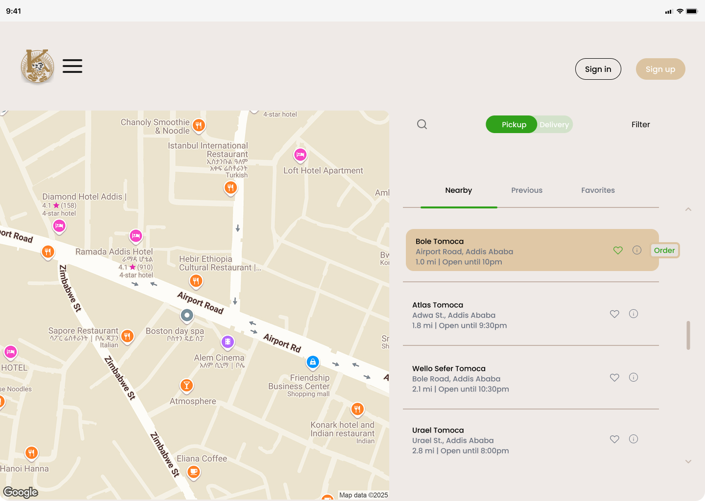
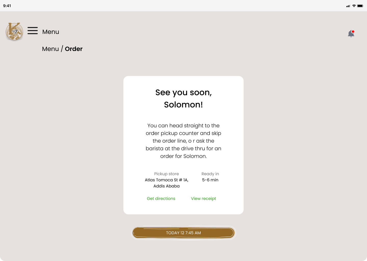
4. Order Flow
Real-time subtotal updates
Pickup vs. Delivery toggle
Location-based
store selection with map integration
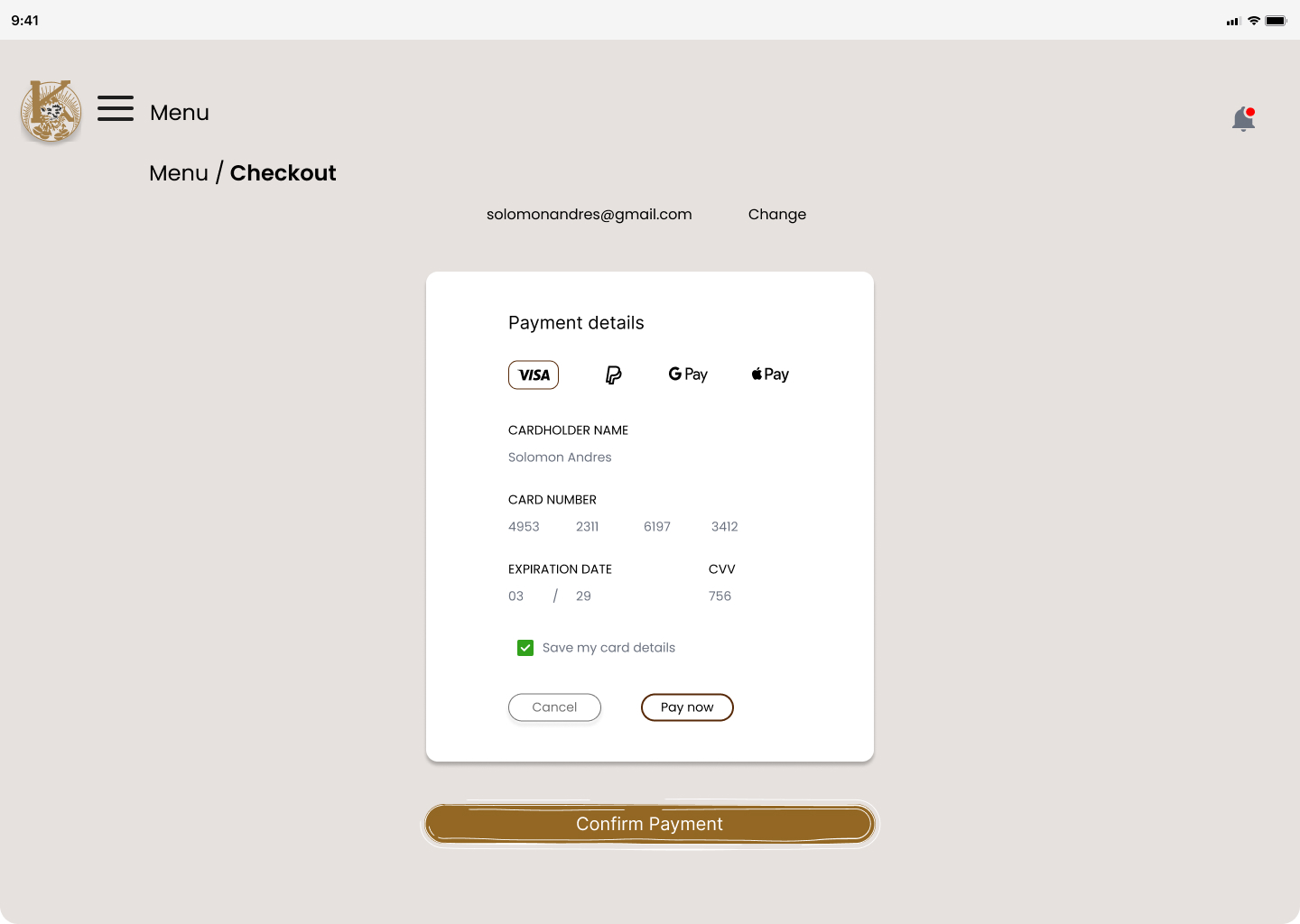
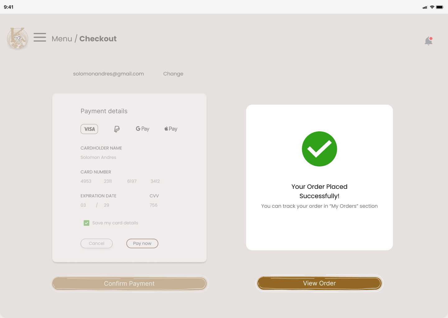
5. Payment Experience
Multiple payment methods: VISA, PayPal, GPay
Secure card
entry with visibility toggle
Confirmation screen with
receipt and order tracking
6. Cultural Integration
Illustrated history of Kaldi and the origin of coffee
Visual
storytelling with heritage motifs and icons
Design System
Color Palette
Earth tones, coffee browns, and heritage greens
Typography
Elegant serif for headers, clean sans-serif for body
Icons
Custom illustrations inspired by Ethiopian art
Key Screens & UX Flow
Welcome & Onboarding
Heritage branding & clear entry points
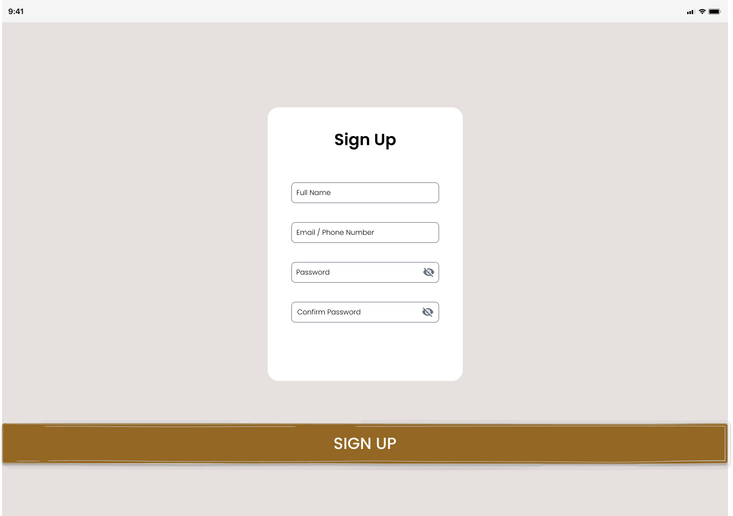
Welcome & Onboarding
Sign up screen
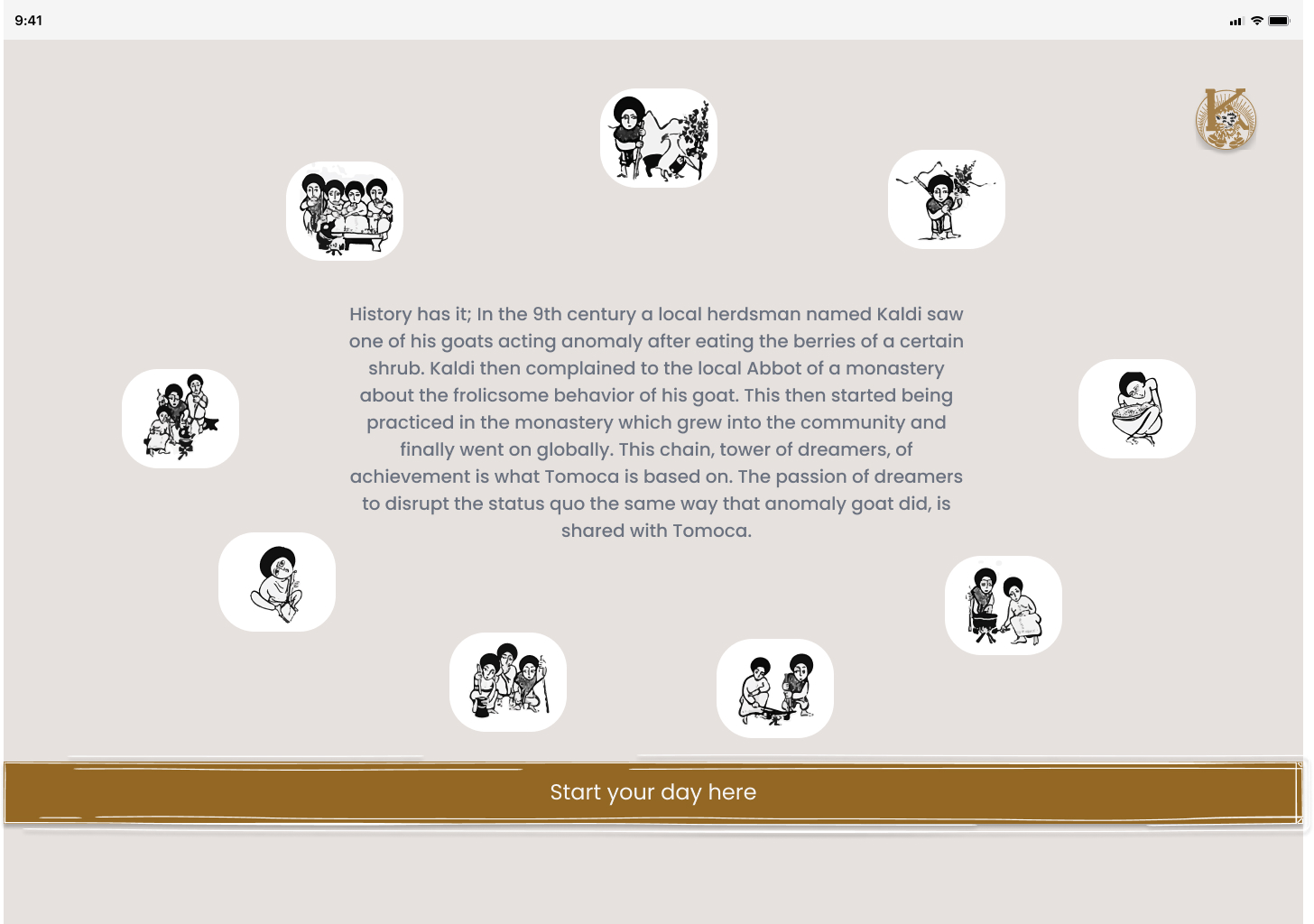
Cultural Storytelling
Kaldi legend & heritage motifs
Menu Navigation
Categorized & personalized
Product Customization
Story + options + nutrition
Order Flow
Pickup / Delivery + map
Payment & Confirmation
Secure & reassuring
Payment & Confirmation
Secure & reassuring
Order Flow
Pickup / Delivery + map
Results & Impact
40% increase in orders within 3 months
25% repeat customer rate via saved preferences
Positive feedback on cultural storytelling and ease of use
Tools Used
Reflection
This project balanced modern UX principles with deep cultural roots. It taught me how to design for emotional resonance, not just efficiency. The result is a digital experience that feels as warm and inviting as a cup of Abol.